Plot Dasar
Matplotlib menyediakan dua cara untuk membuat plot: pyplot interface (sederhana) dan object-oriented interface (lebih fleksibel).
Pyplot Interface
Cara paling sederhana untuk membuat plot:
import matplotlib.pyplot as plt
import numpy as np

x = np.linspace(0, 10, 100)
y = np.sin(x)

plt.plot(x, y)
plt.show()
Object-Oriented Interface
Memberikan kontrol lebih dan direkomendasikan untuk plot kompleks:
import matplotlib.pyplot as plt
import numpy as np

x = np.linspace(0, 10, 100)
y = np.sin(x)

# Membuat figure dan axes
fig, ax = plt.subplots()
ax.plot(x, y)
ax.set_xlabel('x')
ax.set_ylabel('y')
ax.set_title('Grafik Sinus')
plt.show()
Line Plot
Plot Sederhana
import matplotlib.pyplot as plt
import numpy as np

x = [1, 2, 3, 4, 5]
y = [2, 4, 6, 8, 10]

plt.plot(x, y)
plt.xlabel('X')
plt.ylabel('Y')
plt.title('Line Plot Sederhana')
plt.show()
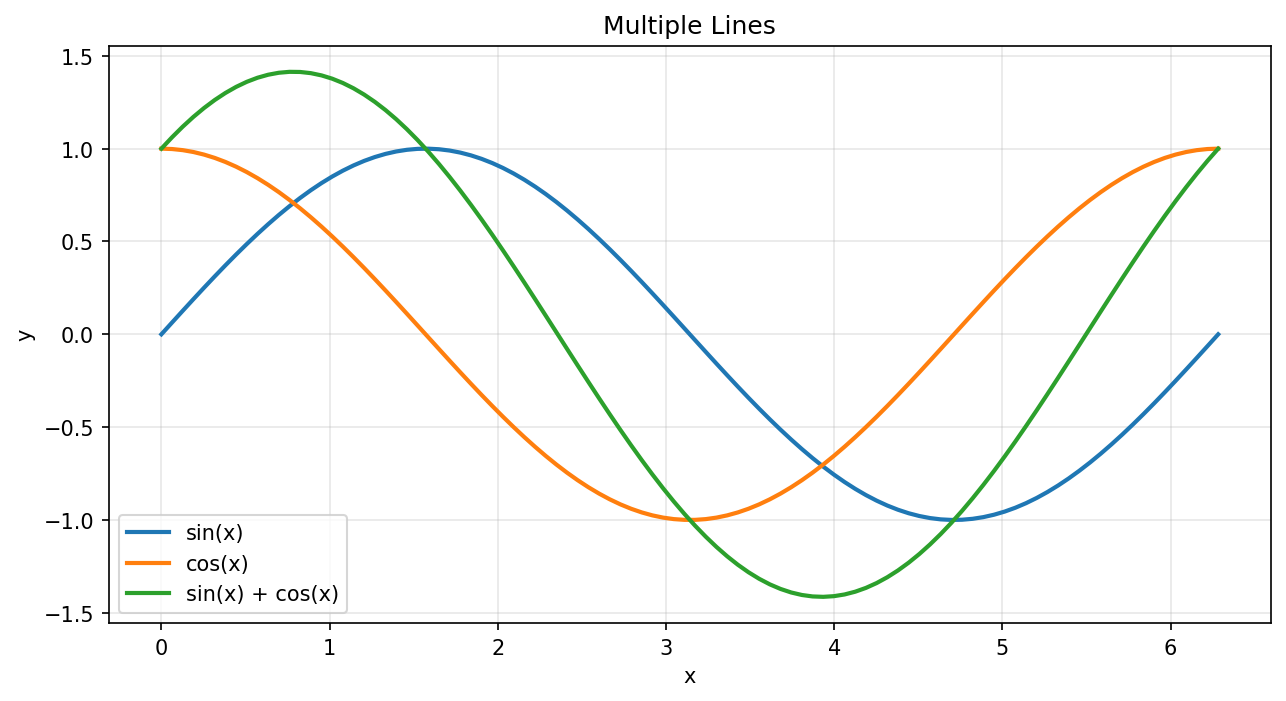
Multiple Lines
import matplotlib.pyplot as plt
import numpy as np

x = np.linspace(0, 2 * np.pi, 100)

plt.figure(figsize=(10, 5))
plt.plot(x, np.sin(x), label='sin(x)')
plt.plot(x, np.cos(x), label='cos(x)')
plt.plot(x, np.sin(x) + np.cos(x), label='sin(x) + cos(x)')

plt.xlabel('x')
plt.ylabel('y')
plt.title('Multiple Lines')
plt.legend()
plt.grid(True)
plt.show()
Plot dengan Multiple Lines
Line Styles
import matplotlib.pyplot as plt
import numpy as np

x = np.linspace(0, 10, 50)

plt.figure(figsize=(10, 6))
plt.plot(x, x, 'r-', label='solid')           # merah, solid
plt.plot(x, x + 2, 'g--', label='dashed')     # hijau, dashed
plt.plot(x, x + 4, 'b-.', label='dash-dot')   # biru, dash-dot
plt.plot(x, x + 6, 'm:', label='dotted')      # magenta, dotted
plt.plot(x, x + 8, 'ko', label='circles')     # hitam, circles

plt.xlabel('x')
plt.ylabel('y')
plt.title('Line Styles')
plt.legend()
plt.show()
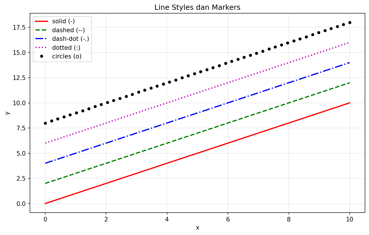
Berbagai Line Styles dan Markers
Scatter Plot
Plot Sederhana
import matplotlib.pyplot as plt
import numpy as np

np.random.seed(42)
x = np.random.randn(100)
y = np.random.randn(100)

plt.scatter(x, y)
plt.xlabel('X')
plt.ylabel('Y')
plt.title('Scatter Plot')
plt.show()
Dengan Warna dan Ukuran
import matplotlib.pyplot as plt
import numpy as np

np.random.seed(42)
n = 100
x = np.random.randn(n)
y = np.random.randn(n)
colors = np.random.rand(n)
sizes = np.random.rand(n) * 300

plt.figure(figsize=(8, 6))
scatter = plt.scatter(x, y, c=colors, s=sizes, alpha=0.6, cmap='plasma')
plt.colorbar(scatter, label='Nilai Warna')
plt.xlabel('X')
plt.ylabel('Y')
plt.title('Scatter Plot dengan Warna dan Ukuran')
plt.show()
Bar Chart
Bar Vertikal
import matplotlib.pyplot as plt

kategori = ['Python', 'Java', 'JavaScript', 'C++', 'Go']
popularitas = [85, 70, 80, 55, 45]

plt.figure(figsize=(8, 5))
plt.bar(kategori, popularitas, color=['#3776ab', '#f89820', '#f7df1e', '#00599c', '#00add8'])
plt.xlabel('Bahasa Pemrograman')
plt.ylabel('Popularitas (%)')
plt.title('Popularitas Bahasa Pemrograman')
plt.show()
Bar Horizontal
import matplotlib.pyplot as plt

kategori = ['Python', 'Java', 'JavaScript', 'C++', 'Go']
popularitas = [85, 70, 80, 55, 45]

plt.figure(figsize=(8, 5))
plt.barh(kategori, popularitas, color='steelblue')
plt.xlabel('Popularitas (%)')
plt.ylabel('Bahasa Pemrograman')
plt.title('Popularitas Bahasa Pemrograman')
plt.show()
Grouped Bar Chart
import matplotlib.pyplot as plt
import numpy as np

kategori = ['A', 'B', 'C', 'D']
nilai_2023 = [25, 32, 28, 35]
nilai_2024 = [30, 35, 33, 40]

x = np.arange(len(kategori))
width = 0.35

fig, ax = plt.subplots(figsize=(8, 5))
bar1 = ax.bar(x - width/2, nilai_2023, width, label='2023')
bar2 = ax.bar(x + width/2, nilai_2024, width, label='2024')

ax.set_xlabel('Kategori')
ax.set_ylabel('Nilai')
ax.set_title('Perbandingan 2023 vs 2024')
ax.set_xticks(x)
ax.set_xticklabels(kategori)
ax.legend()
plt.show()
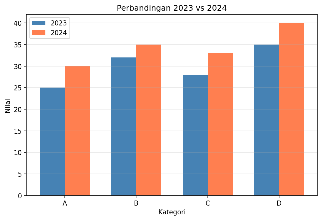
Grouped Bar Chart
Histogram
import matplotlib.pyplot as plt
import numpy as np

np.random.seed(42)
data = np.random.randn(1000)

plt.figure(figsize=(10, 5))

# Histogram dengan density
plt.hist(data, bins=30, density=True, alpha=0.7, color='steelblue', edgecolor='black')

# Overlay dengan kurva normal
x = np.linspace(-4, 4, 100)
plt.plot(x, 1/(np.sqrt(2*np.pi)) * np.exp(-x**2/2), 'r-', linewidth=2, label='Distribusi Normal')

plt.xlabel('Nilai')
plt.ylabel('Densitas')
plt.title('Histogram dengan Kurva Normal')
plt.legend()
plt.show()
Pie Chart
import matplotlib.pyplot as plt

labels = ['Python', 'Java', 'JavaScript', 'C++', 'Lainnya']
sizes = [35, 25, 20, 10, 10]
colors = ['#3776ab', '#f89820', '#f7df1e', '#00599c', '#888888']
explode = (0.1, 0, 0, 0, 0)  # "meledakkan" slice pertama

plt.figure(figsize=(8, 8))
plt.pie(sizes, explode=explode, labels=labels, colors=colors,
        autopct='%1.1f%%', shadow=True, startangle=90)
plt.title('Distribusi Penggunaan Bahasa Pemrograman')
plt.axis('equal')
plt.show()
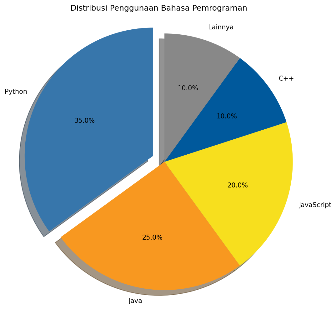
Pie Chart
Menyimpan Figure
import matplotlib.pyplot as plt
import numpy as np

x = np.linspace(0, 10, 100)
y = np.sin(x)

plt.figure(figsize=(8, 4))
plt.plot(x, y)
plt.title('Grafik untuk Disimpan')

# Menyimpan dalam berbagai format
plt.savefig('grafik.png', dpi=300, bbox_inches='tight')
plt.savefig('grafik.pdf', bbox_inches='tight')
plt.savefig('grafik.svg', bbox_inches='tight')

plt.show()
Parameter penting savefig():
dpi- Resolusi (dots per inch)bbox_inches='tight'- Menghilangkan whitespace berlebihtransparent=True- Background transparan