Kustomisasi Plot
Matplotlib memberikan kontrol penuh untuk menyesuaikan tampilan grafik.
Warna
Warna Named
import matplotlib.pyplot as plt
import numpy as np

x = np.linspace(0, 10, 100)

plt.figure(figsize=(10, 5))
plt.plot(x, np.sin(x), color='red', label='red')
plt.plot(x, np.sin(x + 1), color='blue', label='blue')
plt.plot(x, np.sin(x + 2), color='green', label='green')
plt.plot(x, np.sin(x + 3), color='orange', label='orange')
plt.legend()
plt.title('Warna Named')
plt.show()
Warna Hex dan RGB
import matplotlib.pyplot as plt
import numpy as np

x = np.linspace(0, 10, 100)

plt.figure(figsize=(10, 5))
plt.plot(x, np.sin(x), color='#FF5733', label='Hex: #FF5733')
plt.plot(x, np.sin(x + 1), color=(0.2, 0.4, 0.6), label='RGB: (0.2, 0.4, 0.6)')
plt.plot(x, np.sin(x + 2), color=(0.8, 0.2, 0.5, 0.7), label='RGBA dengan alpha')
plt.legend()
plt.title('Warna Hex dan RGB')
plt.show()
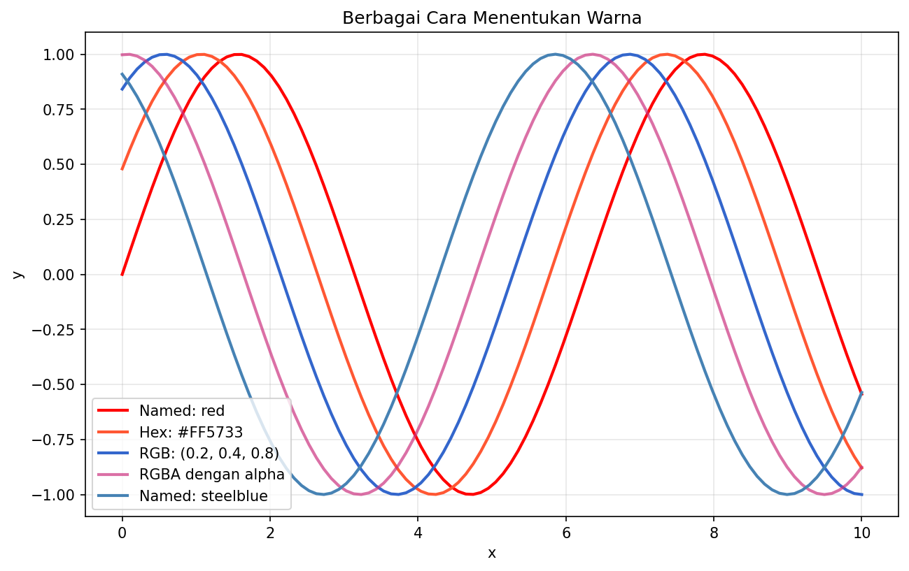
Berbagai cara menentukan warna di Matplotlib
Colormap
import matplotlib.pyplot as plt
import numpy as np

# Menampilkan berbagai colormap
cmaps = ['viridis', 'plasma', 'inferno', 'magma', 'cividis',
         'Greys', 'Blues', 'Reds', 'YlOrRd', 'coolwarm']

fig, axes = plt.subplots(2, 5, figsize=(15, 4))
axes = axes.flatten()

data = np.random.rand(10, 10)

for ax, cmap in zip(axes, cmaps):
    im = ax.imshow(data, cmap=cmap)
    ax.set_title(cmap)
    ax.axis('off')

plt.tight_layout()
plt.show()
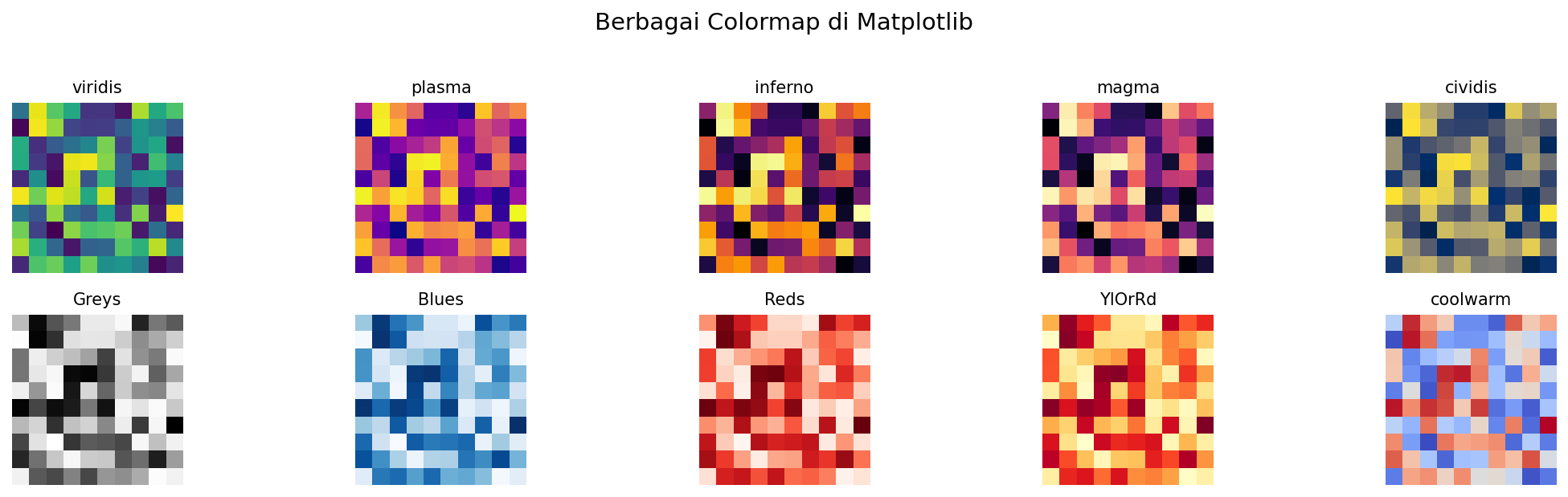
Berbagai colormap yang tersedia di Matplotlib
Line Style dan Marker
Line Style
import matplotlib.pyplot as plt
import numpy as np

x = np.linspace(0, 10, 20)

fig, ax = plt.subplots(figsize=(10, 6))

linestyles = ['-', '--', '-.', ':']
names = ['solid', 'dashed', 'dashdot', 'dotted']

for i, (ls, name) in enumerate(zip(linestyles, names)):
    ax.plot(x, x + i * 3, linestyle=ls, linewidth=2, label=f'{name} ({ls})')

ax.legend()
ax.set_title('Line Styles')
plt.show()
Markers
import matplotlib.pyplot as plt
import numpy as np

x = np.arange(10)

fig, ax = plt.subplots(figsize=(12, 8))

markers = ['o', 's', '^', 'D', 'v', '<', '>', 'p', '*', 'h', '+', 'x']
names = ['circle', 'square', 'triangle_up', 'diamond', 'triangle_down',
         'triangle_left', 'triangle_right', 'pentagon', 'star',
         'hexagon', 'plus', 'x']

for i, (marker, name) in enumerate(zip(markers, names)):
    ax.plot(x, x + i * 2, marker=marker, markersize=10,
            linewidth=1, label=f'{name} ({marker})')

ax.legend(bbox_to_anchor=(1.05, 1), loc='upper left')
ax.set_title('Markers')
plt.tight_layout()
plt.show()
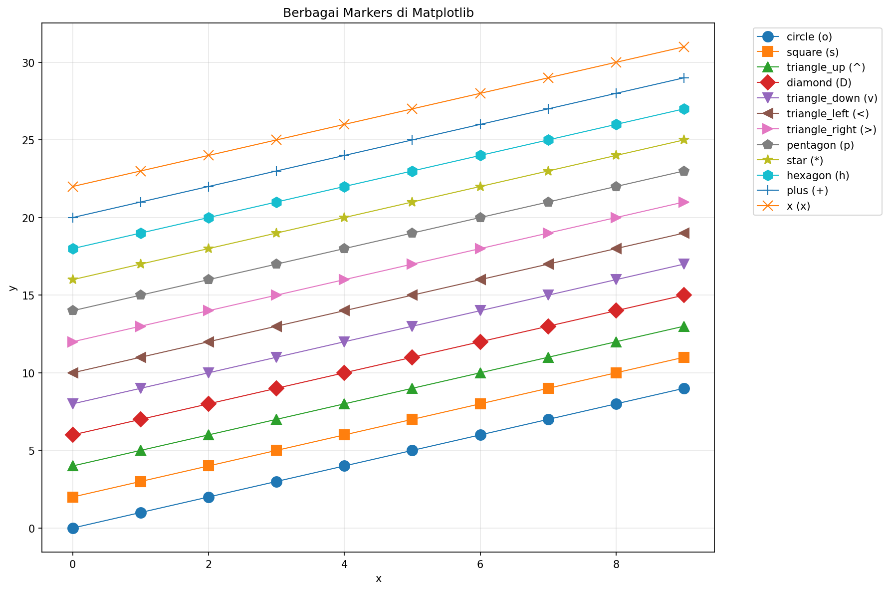
Berbagai jenis markers di Matplotlib
Font dan Text
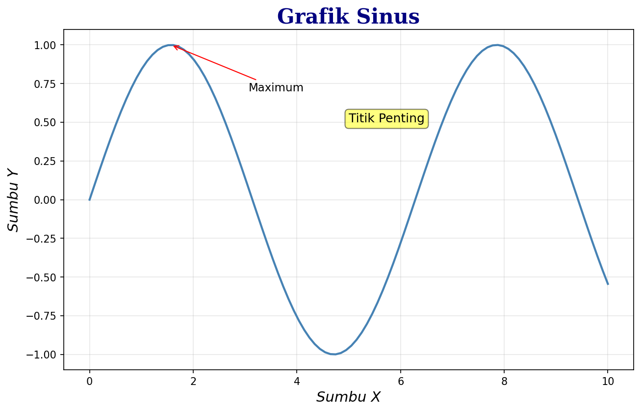
Kustomisasi Font
import matplotlib.pyplot as plt
import numpy as np

x = np.linspace(0, 10, 100)
y = np.sin(x)

plt.figure(figsize=(10, 6))
plt.plot(x, y)

# Title dengan font kustom
plt.title('Grafik Sinus', fontsize=20, fontweight='bold',
          fontfamily='serif', color='navy')

# Label dengan font berbeda
plt.xlabel('Sumbu X', fontsize=14, fontstyle='italic')
plt.ylabel('Sumbu Y', fontsize=14, fontstyle='italic')

# Text annotation
plt.text(5, 0.5, 'Titik Penting', fontsize=12,
         bbox=dict(boxstyle='round', facecolor='yellow', alpha=0.5))

plt.show()
Annotation dengan Arrow
import matplotlib.pyplot as plt
import numpy as np

x = np.linspace(0, 2 * np.pi, 100)
y = np.sin(x)

plt.figure(figsize=(10, 6))
plt.plot(x, y)

# Annotate maximum
plt.annotate('Maximum', xy=(np.pi/2, 1), xytext=(np.pi/2 + 1, 1.2),
             fontsize=12, arrowprops=dict(arrowstyle='->', color='red'))

# Annotate minimum
plt.annotate('Minimum', xy=(3*np.pi/2, -1), xytext=(3*np.pi/2 + 0.5, -0.5),
             fontsize=12, arrowprops=dict(arrowstyle='->', color='blue'))

plt.title('Sin(x) dengan Annotations')
plt.xlabel('x')
plt.ylabel('sin(x)')
plt.grid(True, alpha=0.3)
plt.show()
Kustomisasi font, text, dan annotation
Axis dan Ticks
Mengatur Range Axis
import matplotlib.pyplot as plt
import numpy as np

x = np.linspace(0, 10, 100)
y = np.sin(x) * np.exp(-x/10)

plt.figure(figsize=(10, 5))
plt.plot(x, y)

# Mengatur range
plt.xlim(0, 8)
plt.ylim(-0.5, 1)

# Atau dengan ax.set_xlim(), ax.set_ylim()

plt.title('Range Axis Dikustomisasi')
plt.show()
Kustomisasi Ticks
import matplotlib.pyplot as plt
import numpy as np

x = np.linspace(0, 2 * np.pi, 100)
y = np.sin(x)

fig, ax = plt.subplots(figsize=(10, 5))
ax.plot(x, y)

# Tick positions
ax.set_xticks([0, np.pi/2, np.pi, 3*np.pi/2, 2*np.pi])
ax.set_xticklabels(['0', 'π/2', 'π', '3π/2', '2π'])

ax.set_yticks([-1, -0.5, 0, 0.5, 1])

# Tick parameters
ax.tick_params(axis='both', which='major', labelsize=12,
               length=10, width=2, colors='navy')

ax.set_title('Kustomisasi Ticks')
plt.show()
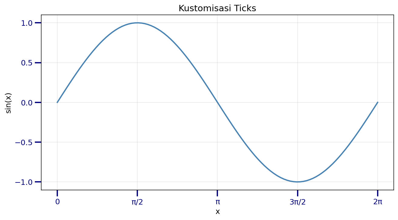
Kustomisasi ticks dengan label khusus
Grid dan Spines
Grid
import matplotlib.pyplot as plt
import numpy as np

x = np.linspace(0, 10, 100)
y = np.sin(x)

fig, axes = plt.subplots(1, 3, figsize=(15, 4))

# Grid default
axes[0].plot(x, y)
axes[0].grid(True)
axes[0].set_title('Grid Default')

# Grid kustom
axes[1].plot(x, y)
axes[1].grid(True, linestyle='--', alpha=0.7, color='gray')
axes[1].set_title('Grid Kustom')

# Grid major dan minor
axes[2].plot(x, y)
axes[2].grid(True, which='major', linestyle='-', linewidth=1, alpha=0.7)
axes[2].grid(True, which='minor', linestyle=':', linewidth=0.5, alpha=0.5)
axes[2].minorticks_on()
axes[2].set_title('Major & Minor Grid')

plt.tight_layout()
plt.show()
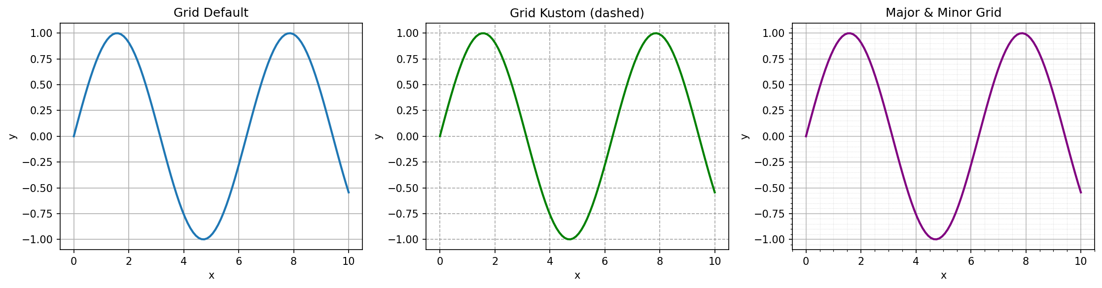
Berbagai style grid
Spines (Bingkai)
import matplotlib.pyplot as plt
import numpy as np

x = np.linspace(-5, 5, 100)
y = x ** 2

fig, axes = plt.subplots(1, 3, figsize=(15, 4))

# Default
axes[0].plot(x, y)
axes[0].set_title('Default Spines')

# Hanya bottom dan left
axes[1].plot(x, y)
axes[1].spines['top'].set_visible(False)
axes[1].spines['right'].set_visible(False)
axes[1].set_title('Bottom & Left Only')

# Centered spines
axes[2].plot(x, y)
axes[2].spines['left'].set_position('center')
axes[2].spines['bottom'].set_position('center')
axes[2].spines['top'].set_visible(False)
axes[2].spines['right'].set_visible(False)
axes[2].set_title('Centered Spines')

plt.tight_layout()
plt.show()
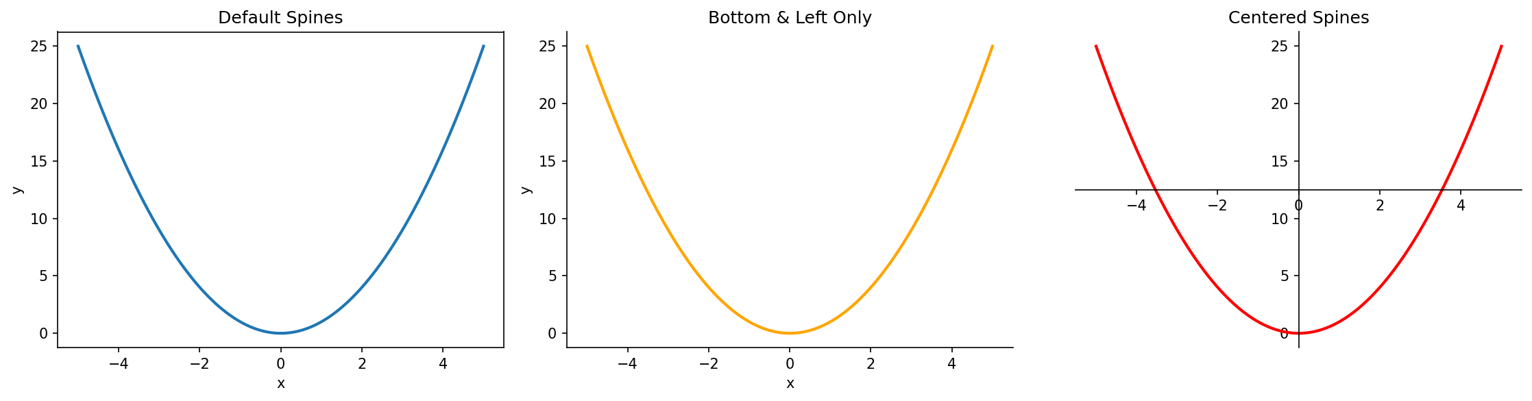
Kustomisasi spines (bingkai)
Legend
import matplotlib.pyplot as plt
import numpy as np

x = np.linspace(0, 10, 100)

plt.figure(figsize=(10, 6))
plt.plot(x, np.sin(x), label='sin(x)')
plt.plot(x, np.cos(x), label='cos(x)')
plt.plot(x, np.tan(x), label='tan(x)')

# Legend dengan kustomisasi
plt.legend(
    loc='upper right',           # Lokasi
    fontsize=12,                 # Ukuran font
    frameon=True,                # Bingkai
    facecolor='white',           # Warna background
    edgecolor='black',           # Warna bingkai
    framealpha=0.9,              # Transparansi
    ncol=3,                      # Jumlah kolom
    title='Fungsi Trigonometri', # Judul legend
    title_fontsize=14
)

plt.ylim(-2, 2)
plt.title('Legend Kustomisasi')
plt.show()
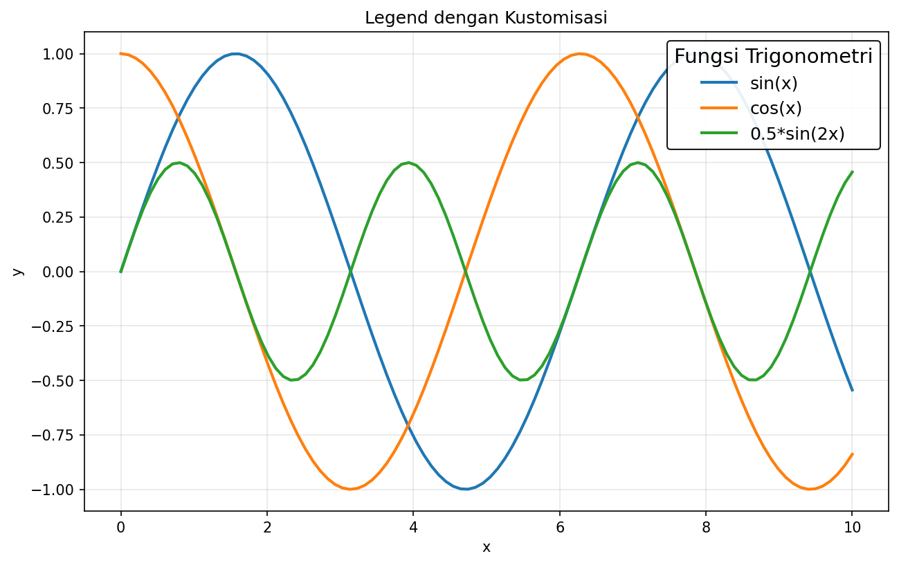
Legend dengan berbagai kustomisasi
Style Sheets
Matplotlib menyediakan style sheets untuk mengubah tampilan keseluruhan:
import matplotlib.pyplot as plt
import numpy as np

# Lihat style yang tersedia
print(plt.style.available)

# Menggunakan style
plt.style.use('seaborn-v0_8-darkgrid')

x = np.linspace(0, 10, 100)
plt.figure(figsize=(10, 5))
plt.plot(x, np.sin(x), label='sin(x)')
plt.plot(x, np.cos(x), label='cos(x)')
plt.legend()
plt.title('Menggunakan Seaborn Style')
plt.show()

# Reset ke default
plt.style.use('default')
Style populer:
'seaborn-v0_8-darkgrid'- Mirip seaborn dengan grid gelap'ggplot'- Mirip ggplot2 dari R'dark_background'- Background gelap'bmh'- Bayesian Methods for Hackers style'fivethirtyeight'- Mirip grafik FiveThirtyEight