Matplotlib
Matplotlib adalah pustaka visualisasi data paling populer di Python. Dengan Matplotlib, kita dapat membuat berbagai jenis grafik seperti line plot, scatter plot, bar chart, histogram, dan banyak lagi.
Mengapa Matplotlib?
Fleksibel - Kontrol penuh atas setiap elemen grafik
Integrasi - Bekerja baik dengan NumPy dan Pandas
Publikasi - Menghasilkan grafik berkualitas publikasi
Interaktif - Mendukung tampilan interaktif di Jupyter Notebook
Instalasi
pip install matplotlib
Import Matplotlib
Konvensi standar untuk mengimport Matplotlib:
import matplotlib.pyplot as plt
import numpy as np
Daftar Materi
Contoh Cepat
Line Plot
import matplotlib.pyplot as plt
import numpy as np

# Data
x = np.linspace(0, 10, 100)
y = np.sin(x)

# Membuat plot
plt.figure(figsize=(8, 4))
plt.plot(x, y, label='sin(x)')
plt.xlabel('x')
plt.ylabel('y')
plt.title('Grafik Fungsi Sinus')
plt.legend()
plt.grid(True)
plt.show()
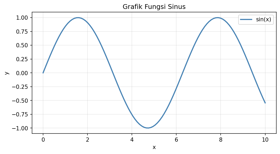
Contoh Line Plot
Scatter Plot
import matplotlib.pyplot as plt
import numpy as np

# Data acak
np.random.seed(42)
x = np.random.randn(50)
y = np.random.randn(50)
colors = np.random.rand(50)
sizes = np.random.rand(50) * 500

# Membuat scatter plot
plt.figure(figsize=(8, 6))
plt.scatter(x, y, c=colors, s=sizes, alpha=0.6, cmap='viridis')
plt.colorbar(label='Nilai Warna')
plt.xlabel('X')
plt.ylabel('Y')
plt.title('Scatter Plot dengan Warna dan Ukuran')
plt.show()
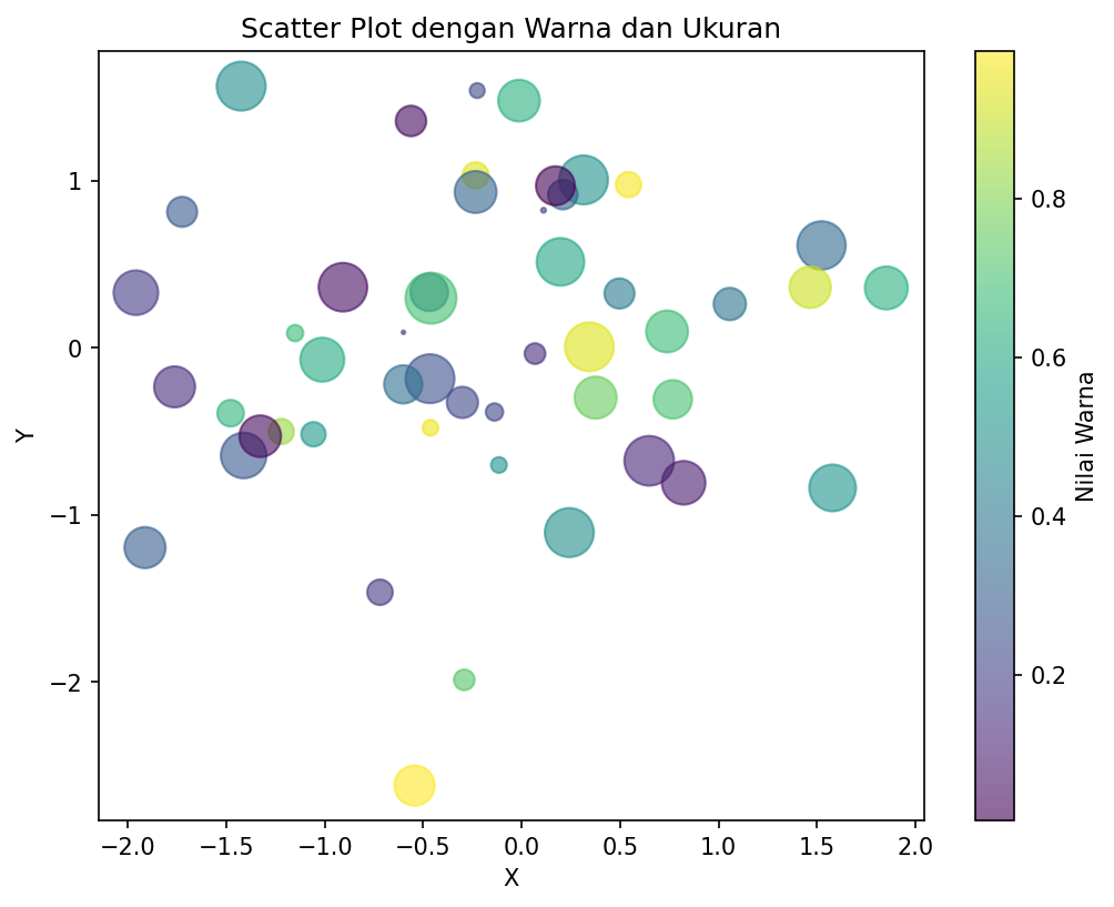
Contoh Scatter Plot
Bar Chart
import matplotlib.pyplot as plt

# Data
kategori = ['A', 'B', 'C', 'D', 'E']
nilai = [23, 45, 56, 78, 32]

# Membuat bar chart
plt.figure(figsize=(8, 5))
plt.bar(kategori, nilai, color='steelblue', edgecolor='black')
plt.xlabel('Kategori')
plt.ylabel('Nilai')
plt.title('Contoh Bar Chart')
plt.show()
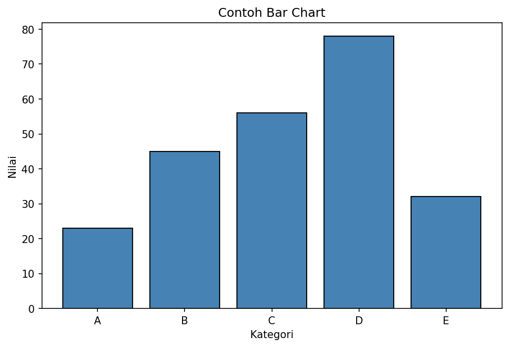
Contoh Bar Chart
Histogram
import matplotlib.pyplot as plt
import numpy as np

# Data distribusi normal
np.random.seed(42)
data = np.random.randn(1000)

# Membuat histogram
plt.figure(figsize=(8, 5))
plt.hist(data, bins=30, color='skyblue', edgecolor='black', alpha=0.7)
plt.xlabel('Nilai')
plt.ylabel('Frekuensi')
plt.title('Histogram Distribusi Normal')
plt.axvline(data.mean(), color='red', linestyle='--', label=f'Mean: {data.mean():.2f}')
plt.legend()
plt.show()
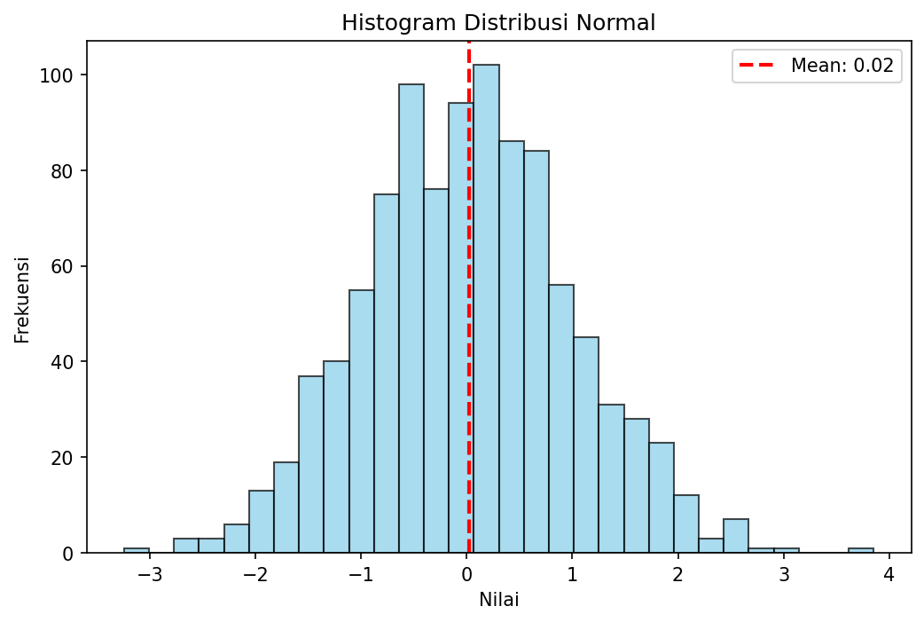
Contoh Histogram
Anatomi Figure Matplotlib
┌────────────────────────────────────────────────────┐
│                     Figure                          │
│  ┌──────────────────────────────────────────────┐  │
│  │                   Title                       │  │
│  │  ┌────────────────────────────────────────┐  │  │
│  │  │                                        │  │  │
│  │  │              Axes (Plot Area)          │  │  │
│  │  │                                        │  │  │
│  │  │    Line/Scatter/Bar...                 │  │  │
│  │  │                                        │  │  │
│  │  └────────────────────────────────────────┘  │  │
│  │              X-axis Label                     │  │
│  └──────────────────────────────────────────────┘  │
│         Y-axis Label (rotated)                      │
└────────────────────────────────────────────────────┘
Figure - Container utama yang menampung semua elemen
Axes - Area plot tempat data digambar
Axis - Sumbu x dan y dengan tick dan label
Title/Labels - Judul dan label sumbu
Langkah Selanjutnya
Lanjutkan ke Plot Dasar untuk mempelajari cara membuat berbagai jenis grafik dasar.