Jenis-Jenis Plot
Matplotlib mendukung berbagai jenis visualisasi untuk kebutuhan yang berbeda.
Box Plot
Box plot berguna untuk melihat distribusi data dan outlier:
import matplotlib.pyplot as plt
import numpy as np

np.random.seed(42)

# Data dengan distribusi berbeda
data1 = np.random.normal(100, 10, 200)
data2 = np.random.normal(90, 20, 200)
data3 = np.random.normal(80, 30, 200)

fig, ax = plt.subplots(figsize=(8, 5))
bp = ax.boxplot([data1, data2, data3], patch_artist=True)

# Warna untuk setiap box
colors = ['lightblue', 'lightgreen', 'lightyellow']
for patch, color in zip(bp['boxes'], colors):
    patch.set_facecolor(color)

ax.set_xticklabels(['Grup A', 'Grup B', 'Grup C'])
ax.set_ylabel('Nilai')
ax.set_title('Perbandingan Distribusi')
plt.show()
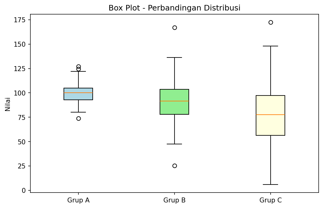
Box Plot untuk perbandingan distribusi
Violin Plot
Kombinasi box plot dengan kernel density estimation:
import matplotlib.pyplot as plt
import numpy as np

np.random.seed(42)

data1 = np.random.normal(0, 1, 100)
data2 = np.random.normal(2, 1.5, 100)
data3 = np.random.normal(-1, 0.5, 100)

fig, ax = plt.subplots(figsize=(8, 5))
parts = ax.violinplot([data1, data2, data3], showmeans=True, showmedians=True)

ax.set_xticks([1, 2, 3])
ax.set_xticklabels(['Distribusi A', 'Distribusi B', 'Distribusi C'])
ax.set_ylabel('Nilai')
ax.set_title('Violin Plot')
plt.show()
Heatmap
Visualisasi matriks dengan warna:
import matplotlib.pyplot as plt
import numpy as np

# Matriks korelasi
np.random.seed(42)
data = np.random.rand(5, 5)

fig, ax = plt.subplots(figsize=(8, 6))
im = ax.imshow(data, cmap='coolwarm')

# Menambahkan colorbar
cbar = ax.figure.colorbar(im, ax=ax)
cbar.ax.set_ylabel('Nilai', rotation=-90, va='bottom')

# Label
labels = ['A', 'B', 'C', 'D', 'E']
ax.set_xticks(np.arange(len(labels)))
ax.set_yticks(np.arange(len(labels)))
ax.set_xticklabels(labels)
ax.set_yticklabels(labels)

# Menambahkan nilai di setiap cell
for i in range(len(labels)):
    for j in range(len(labels)):
        text = ax.text(j, i, f'{data[i, j]:.2f}',
                       ha='center', va='center', color='black')

ax.set_title('Heatmap')
plt.tight_layout()
plt.show()
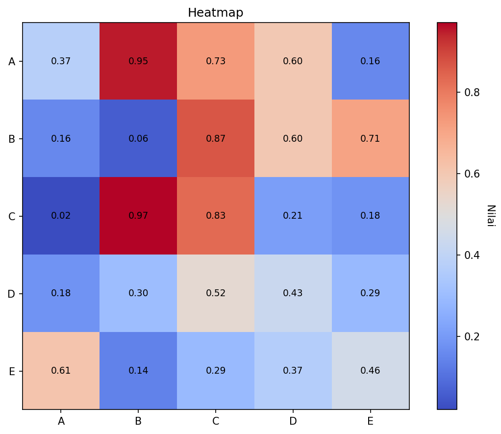
Heatmap dengan nilai di setiap cell
Contour Plot
Untuk visualisasi 3D dalam 2D:
import matplotlib.pyplot as plt
import numpy as np

# Membuat grid
x = np.linspace(-3, 3, 100)
y = np.linspace(-3, 3, 100)
X, Y = np.meshgrid(x, y)
Z = np.sin(X) * np.cos(Y)

fig, axes = plt.subplots(1, 2, figsize=(12, 5))

# Contour lines
ax1 = axes[0]
cs = ax1.contour(X, Y, Z, levels=15)
ax1.clabel(cs, inline=True, fontsize=8)
ax1.set_title('Contour Lines')
ax1.set_xlabel('X')
ax1.set_ylabel('Y')

# Filled contour
ax2 = axes[1]
cf = ax2.contourf(X, Y, Z, levels=15, cmap='viridis')
plt.colorbar(cf, ax=ax2)
ax2.set_title('Filled Contour')
ax2.set_xlabel('X')
ax2.set_ylabel('Y')

plt.tight_layout()
plt.show()
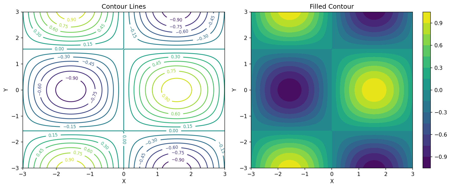
Contour Lines dan Filled Contour
3D Plot
Matplotlib mendukung plotting 3D:
import matplotlib.pyplot as plt
import numpy as np
from mpl_toolkits.mplot3d import Axes3D

# Data
x = np.linspace(-5, 5, 50)
y = np.linspace(-5, 5, 50)
X, Y = np.meshgrid(x, y)
Z = np.sin(np.sqrt(X**2 + Y**2))

# 3D Surface Plot
fig = plt.figure(figsize=(10, 7))
ax = fig.add_subplot(111, projection='3d')

surf = ax.plot_surface(X, Y, Z, cmap='viridis', edgecolor='none')
fig.colorbar(surf, shrink=0.5, aspect=5)

ax.set_xlabel('X')
ax.set_ylabel('Y')
ax.set_zlabel('Z')
ax.set_title('3D Surface Plot')

plt.show()
Error Bar
Menampilkan ketidakpastian data:
import matplotlib.pyplot as plt
import numpy as np

x = np.arange(1, 6)
y = [23, 45, 56, 78, 43]
error = [3, 5, 2, 4, 6]

plt.figure(figsize=(8, 5))
plt.errorbar(x, y, yerr=error, fmt='o-', capsize=5, capthick=2,
             color='steelblue', ecolor='red', label='Data dengan Error')
plt.xlabel('Sampel')
plt.ylabel('Nilai')
plt.title('Error Bar Plot')
plt.legend()
plt.grid(True, alpha=0.3)
plt.show()
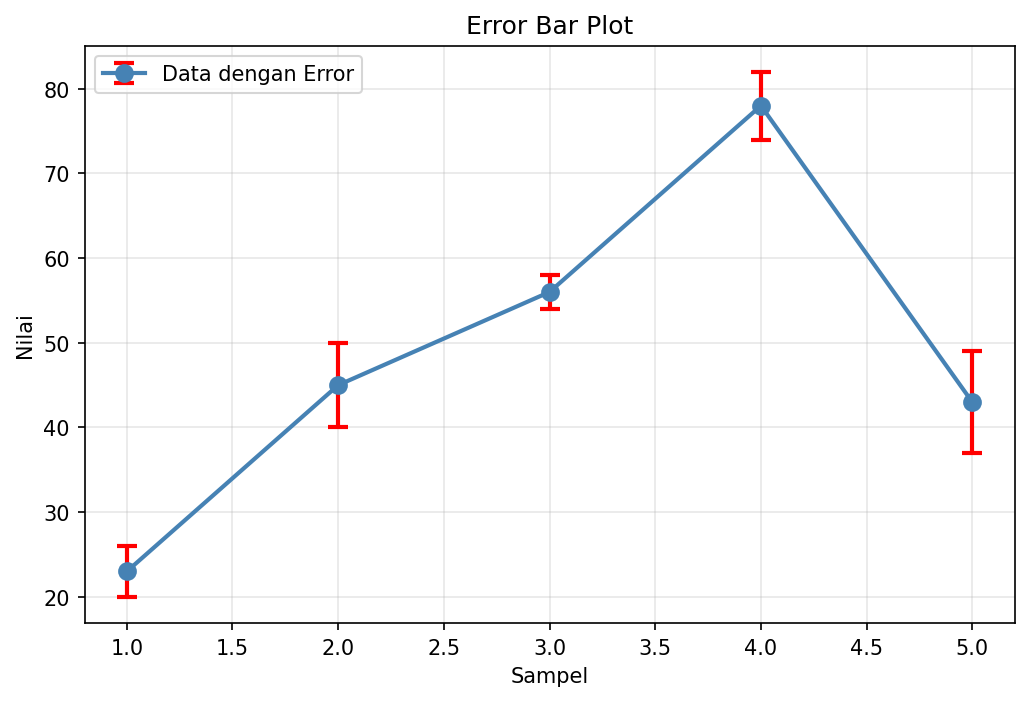
Error Bar Plot
Area Plot (Stacked)
import matplotlib.pyplot as plt
import numpy as np

x = np.arange(1, 11)
y1 = np.random.randint(10, 30, 10)
y2 = np.random.randint(20, 40, 10)
y3 = np.random.randint(15, 35, 10)

plt.figure(figsize=(10, 5))
plt.stackplot(x, y1, y2, y3, labels=['Produk A', 'Produk B', 'Produk C'],
              colors=['#ff9999', '#66b3ff', '#99ff99'], alpha=0.8)
plt.xlabel('Bulan')
plt.ylabel('Penjualan')
plt.title('Stacked Area Plot')
plt.legend(loc='upper left')
plt.show()
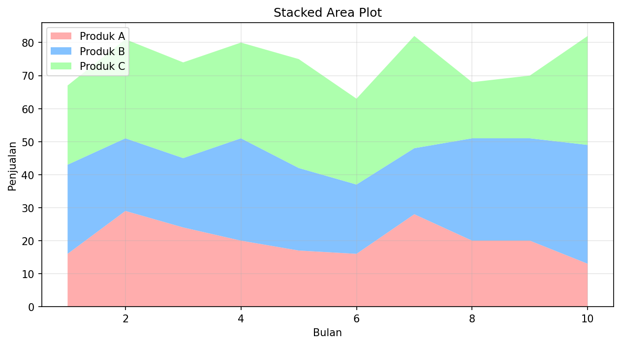
Stacked Area Plot
Polar Plot
import matplotlib.pyplot as plt
import numpy as np

# Data
theta = np.linspace(0, 2 * np.pi, 100)
r = 1 + np.sin(3 * theta)

fig, ax = plt.subplots(subplot_kw={'projection': 'polar'}, figsize=(8, 8))
ax.plot(theta, r, 'b-', linewidth=2)
ax.fill(theta, r, alpha=0.3)
ax.set_title('Polar Plot: r = 1 + sin(3θ)')
plt.show()
Stem Plot
Berguna untuk data diskrit:
import matplotlib.pyplot as plt
import numpy as np

x = np.arange(0, 10)
y = np.random.randint(1, 10, 10)

plt.figure(figsize=(10, 5))
markerline, stemlines, baseline = plt.stem(x, y)
plt.setp(markerline, marker='o', markersize=10, color='red')
plt.setp(stemlines, color='steelblue', linewidth=2)
plt.xlabel('Index')
plt.ylabel('Nilai')
plt.title('Stem Plot')
plt.show()